Introduction
In the fast-paced world of trade shows, your exhibit’s footprint isn’t just about how much square footage you have—it’s about how effectively you use that space to engage attendees. Smart space optimization can transform even the smallest booths into powerful brand experiences. Whether you’re working with a tight corner or a massive area, here’s how you can make every inch of your exhibit count.
1. Leverage Vertical Space
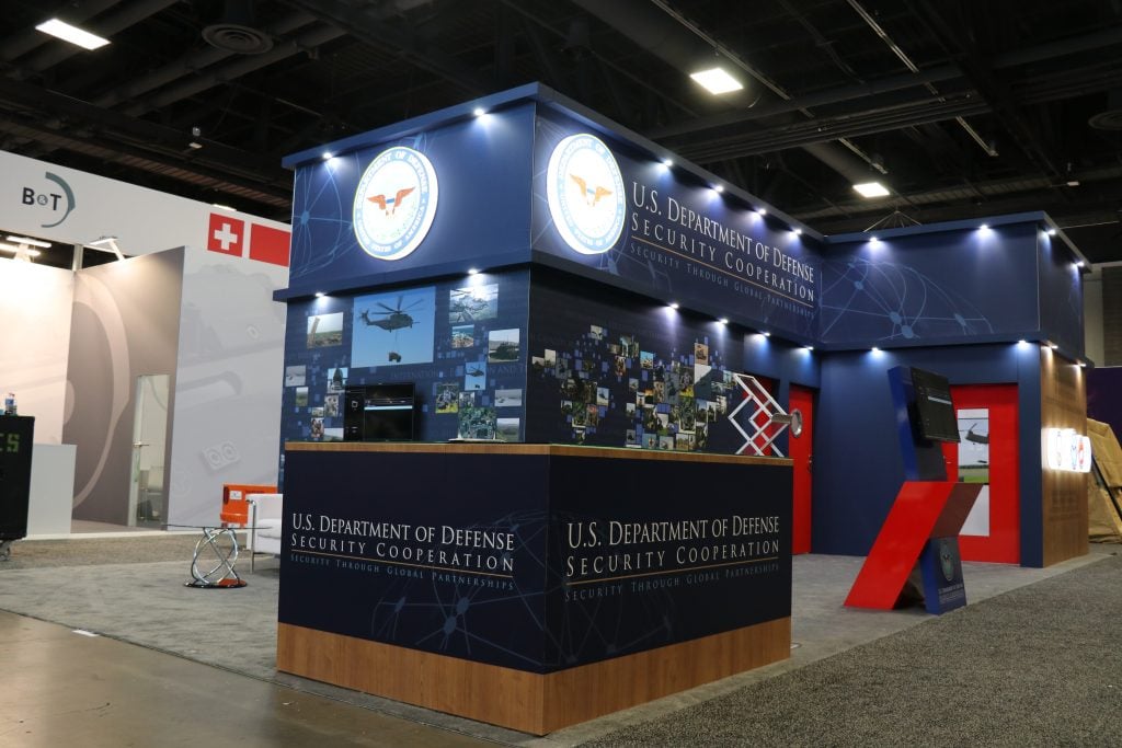
Don’t just think in terms of floor area—look up! Utilizing vertical space can add depth to your exhibit and draw attendees’ attention from a distance.
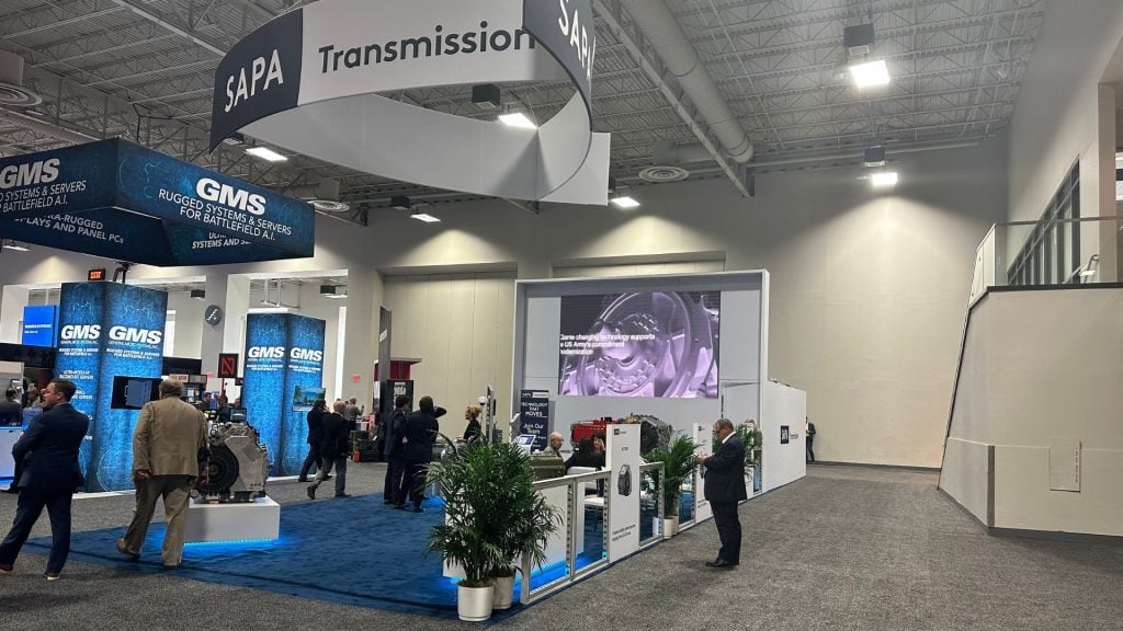
- Hanging Signage: Incorporate overhead signage to create visibility from across the exhibit hall. Custom banners or light-up signs can showcase your brand name and message from any angle.
- Tall Structures: Use tall elements like shelving, displays, or digital screens to showcase products and messaging without taking up precious floor space.
- Vertical Displays: For smaller spaces, vertical product displays allow you to showcase a variety of items without crowding the booth.
2. Create Zones for Different Engagements
Breaking your booth into different zones allows attendees to experience your brand in multiple ways, increasing engagement without overwhelming them.
- Demo Areas: Designate a specific area for product demonstrations or hands-on interactions. This keeps the focus on your product while preventing crowding in other areas.
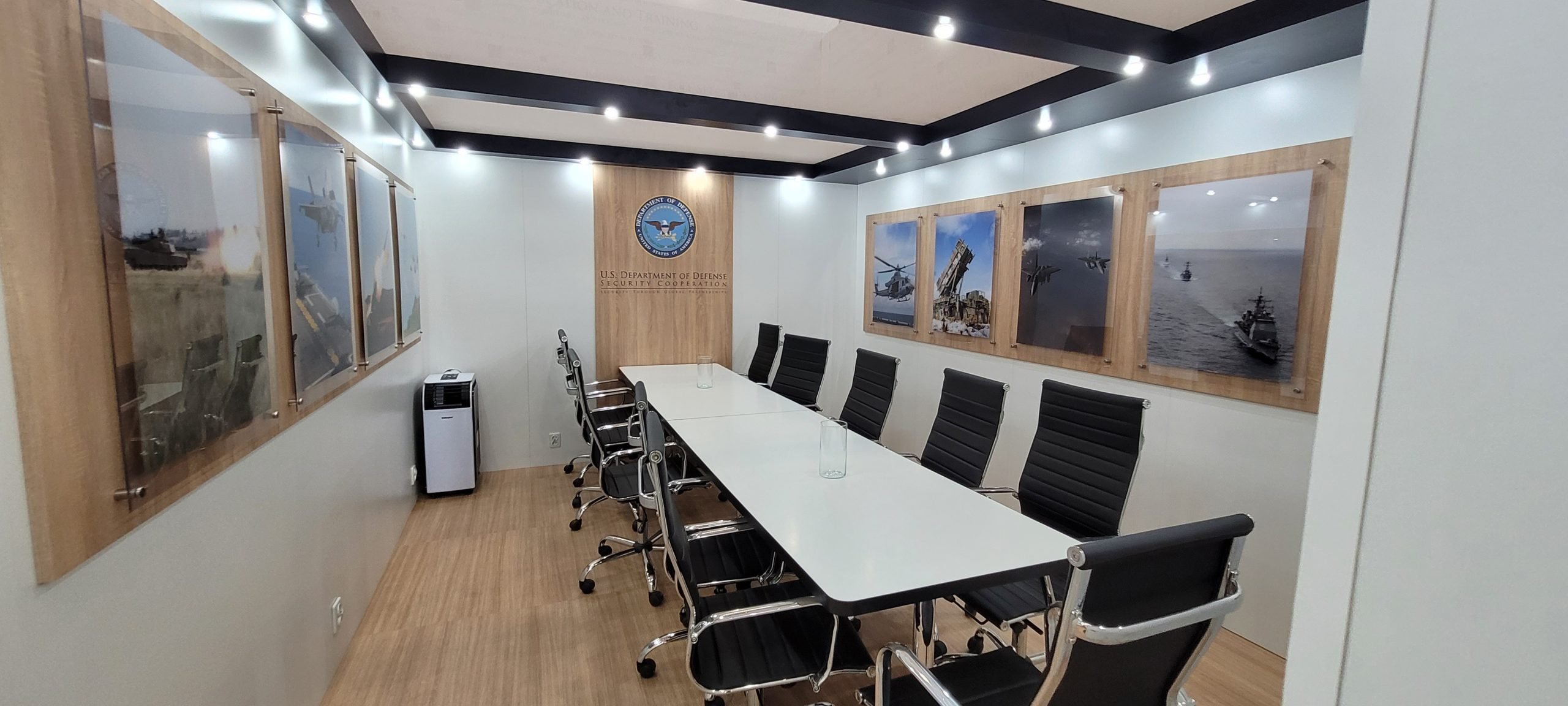
- Seating and Networking Zones: A comfortable seating area, even if it’s just a few stools and a table, can encourage longer conversations and deeper engagement.
- Social Media Spot: Consider creating a “social media moment” zone with branded backdrops or interactive elements. This encourages visitors to snap pictures, tag your brand, and share on social media—expanding your reach beyond the event.
3. Use Modular Design for Flexibility
Modular booth designs are incredibly versatile and can help you adapt your layout to different events and space sizes. They also allow for easy reconfiguration on the fly.
- Adjustable Layouts: Use modular walls, counters, and displays that can be rearranged based on the flow of traffic or last-minute changes to your space allocation.
- Interchangeable Elements: Make key booth elements interchangeable so you can switch things up depending on how attendees engage with your exhibit.
- Quick Reconfiguration: Modular setups allow you to quickly reconfigure your space, keeping the booth fresh and engaging throughout multi-day events.
4. Incorporate Interactive Technology
Technology can do a lot of the heavy lifting when it comes to engagement—without taking up much space.
- Touchscreen Displays: Touchscreens or tablets allow visitors to browse through product catalogs, watch demos, or sign up for follow-ups, all without crowding the booth.
- Augmented Reality (AR): AR experiences can showcase products or services in a virtual space, providing an interactive and immersive experience without needing physical items to be displayed.
- Digital Kiosks: These allow attendees to interact with your brand and products through videos, quizzes, or games. They’re space-efficient and attention-grabbing.
5. Keep Traffic Flow in Mind
A crowded, difficult-to-navigate booth can deter visitors. Plan your layout to ensure smooth traffic flow, keeping high-engagement areas easily accessible.
- Open Layouts: Opt for an open booth layout that invites attendees in from multiple directions, reducing bottlenecks and encouraging more foot traffic.
- Clear Pathways: Ensure pathways are clear so attendees can move freely from one area of the booth to another without feeling cramped.
- Strategic Placement: Place interactive elements, like demos or giveaways, near the booth’s edge to draw people in. Reserve more intimate, conversational spaces for the back of the booth.
6. Think Minimalist for Maximum Impact
When in doubt, less is more. Overloading your exhibit with too many elements can overwhelm visitors and dilute your message.
- Strategic Focal Points: Choose a few key elements that highlight your brand’s message or products. Make them the stars of your exhibit.
- Clean Design: A minimalist approach with clean lines, well-placed visuals, and uncluttered spaces creates a modern, professional atmosphere that keeps attendees focused on what matters most—your brand.
- Decluttered Counters: Keep counters free of excessive materials. Instead, focus on essential items like business cards, brochures, or interactive tablets.
Conclusion: Maximize Engagement, Not Just Space
No matter the size of your exhibit, smart space optimization can make a big impact. By using vertical space, creating engaging zones, incorporating interactive technology, and ensuring smooth traffic flow, you can maximize attendee engagement and make your booth a standout attraction. When every inch counts, strategic design can turn even the smallest space into a powerful brand-building experience.


 Global
 Europe

