
 Global
 Europe
Introduction
When it comes to trade show booths, design elements like layout and technology often take center stage. However, one crucial aspect frequently overlooked is color psychology. The colors you choose for your booth can significantly influence attendee emotions, perceptions, and actions.
In this blog, we’ll dive into the power of color psychology, explore how it impacts visitor behavior, and provide actionable tips to create a visually striking and strategically impactful trade show booth.
Why Color Psychology Matters in Trade Show Booths
Color is more than an aesthetic choice—it’s a communication tool that triggers emotions and conveys messages at a glance. In a bustling trade show environment, where attendees are bombarded with visual stimuli, the right colors can:
- Attract Attention: Bold and strategically chosen colors can help your booth stand out in a sea of competition.
- Reinforce Brand Identity: Consistent use of brand colors builds recognition and trust.
- Evoke Emotions: Colors can create moods and associations that align with your brand message.
- Influence Decisions: Studies show that color can affect purchasing behavior and the perception of a product or service.
The Psychology of Popular Colors in Booth Design
- Red: Energy and Urgency
- Evokes passion, excitement, and action.
- Best for brands that want to convey urgency or boldness.
- Use sparingly to avoid overwhelming the audience.
- Example: A tech brand might use red to highlight special offers or new launches.
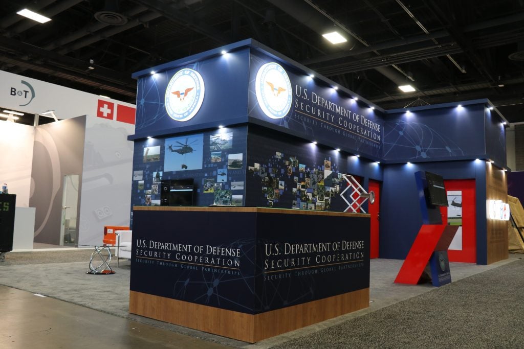
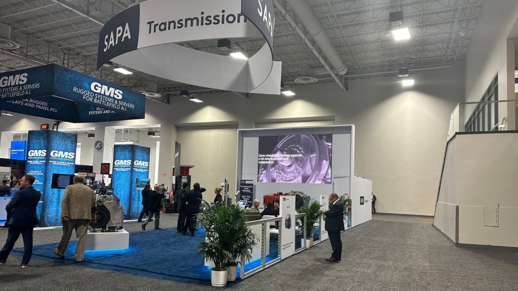
- Blue: Trust and Dependability
- Associated with calm, trust, and professionalism.
- Ideal for industries like finance, healthcare, and technology.
- Avoid overuse, as it can feel cold or distant.
- Example: A cybersecurity company might use blue to communicate security and reliability.
- Green: Growth and Sustainability
- Symbolizes nature, balance, and eco-consciousness.
- Perfect for brands emphasizing environmental responsibility or health.
- Example: A wellness brand could use green to reinforce its commitment to natural products.
- Yellow: Optimism and Attention
- Represents happiness, energy, and optimism.
- Use it to grab attention, but balance it with neutral tones to avoid overstimulation.
- Example: A children’s product company might use yellow to convey playfulness and energy.
- Black: Sophistication and Power
- Conveys elegance, luxury, and authority.
- Works well for high-end or minimalist brands.
- Example: A luxury watch brand might use black for a sleek, premium look.
- White: Simplicity and Clarity
- Reflects cleanliness, simplicity, and modernity.
- A great choice for minimalist designs or to balance bold colors.
- Example: A tech startup might use white as a canvas for showcasing colorful graphics.
Strategies for Using Color in Trade Show Booths
- Align Colors with Your Brand Identity:
Stick to your brand’s color palette to ensure consistency across marketing materials and booth design. - Use Contrasting Colors for Key Elements:
Highlight important areas like product displays, call-to-action buttons, or promotional signage with contrasting colors to draw attention. - Create Zones with Color:
Use different colors to define specific areas in your booth, such as meeting spaces, product demo areas, or interactive zones. - Consider Cultural Context:
Keep in mind that color meanings can vary across cultures. For example, white represents purity in Western cultures but may symbolize mourning in others. - Balance Bright and Neutral Tones:
Bright colors can capture attention, but balancing them with neutrals ensures your booth doesn’t feel overwhelming.
Examples of Effective Color Usage in Booths
- Adobe: Known for its creative software, Adobe often uses bold reds and whites to create an energetic yet clean look.
- Tesla: Tesla’s booths are sleek and modern, using black, white, and silver to exude luxury and innovation.
- The Body Shop: This beauty brand incorporates green and earthy tones to reinforce its eco-friendly values.
Measuring the Impact of Your Color Choices
After implementing a color strategy, evaluate its effectiveness through:
- Visitor Feedback: Ask attendees how they perceived your booth and its messaging.
- Engagement Metrics: Analyze foot traffic, time spent at the booth, and lead conversions.
- Brand Recall: Follow up with attendees to measure how well they remember your booth and its visuals.
Future Trends in Trade Show Color Psychology
As technology advances, we may see the rise of adaptive color schemes in booths. Imagine using LED lighting to shift colors based on the time of day, mood, or visitor demographics. This dynamic approach could make booths even more engaging and personalized.
Conclusion
The psychology of color is a powerful tool in trade show booth design. By understanding how colors influence emotions and decisions, you can create a booth that not only captures attention but also aligns with your brand’s message and goals.
Let your colors speak louder than words at your next trade show—because sometimes, the right hue can make all the difference.