Introduction:
In the fast-paced world of trade shows, where every exhibitor is vying for attention, it’s easy to fall into the trap of cluttered and over-the-top booth designs. However, there’s a growing trend towards minimalism in trade show booth design—a streamlined and understated approach that can be surprisingly powerful in capturing attention and making a lasting impression. In this guide, we’ll explore the principles of minimalism in booth design and how you can harness its power to stand out from the crowd.
1. Less is More:
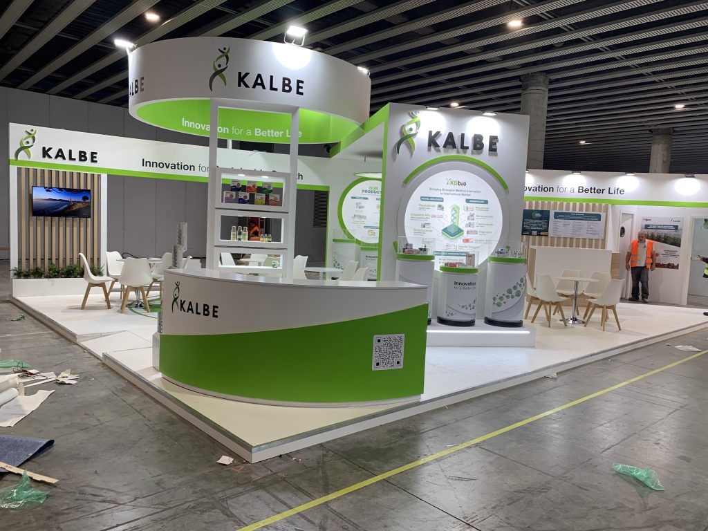
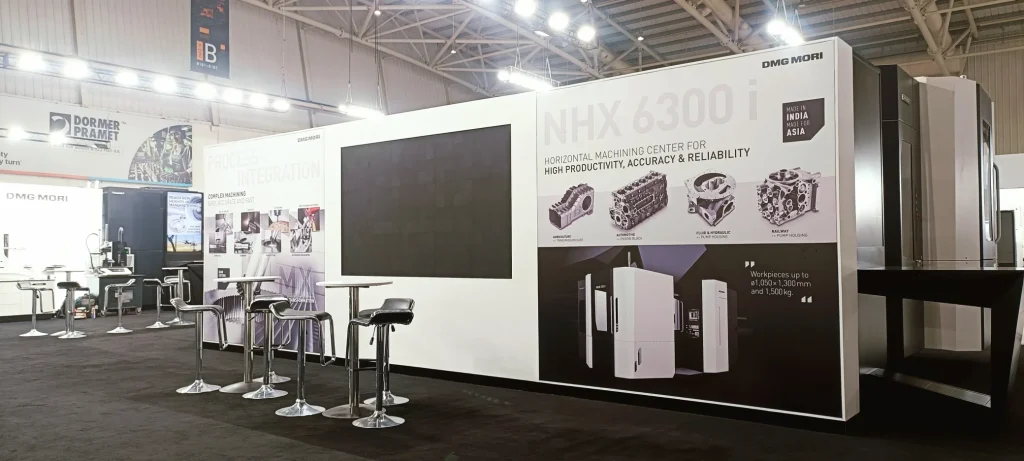
Minimalism is all about stripping away the unnecessary and focusing on what truly matters. Instead of cramming your booth with every product, decoration, and promotional item imaginable, pare it down to the essentials. Embrace empty space and allow your key elements to breathe and command attention.
2. Clean Lines and Simple Shapes:
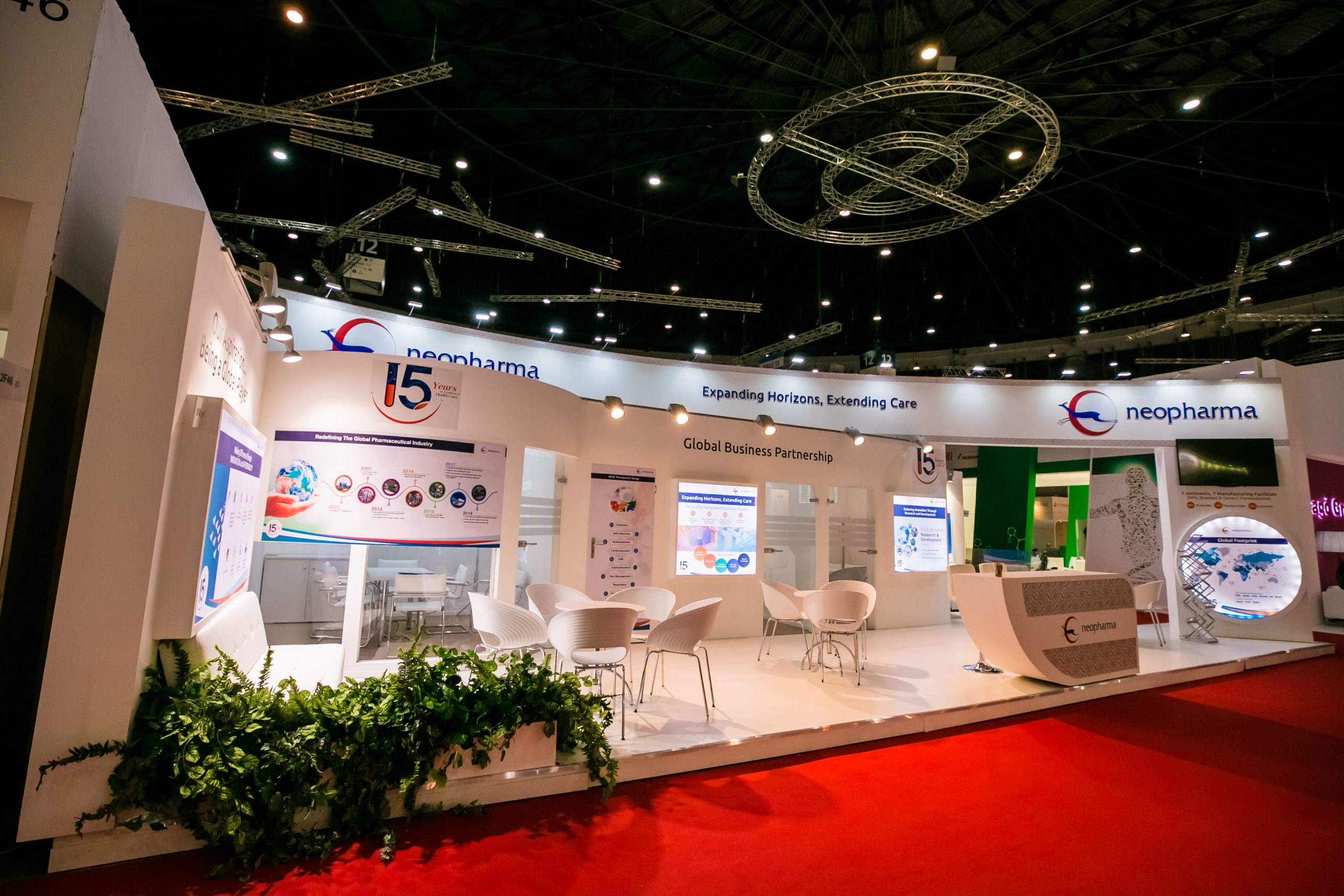
Minimalist design is characterized by clean lines, simple shapes, and a sense of order and balance. Opt for sleek and uncluttered booth layouts, with geometric shapes and symmetrical arrangements that create a sense of harmony and visual appeal. Avoid ornate decorations and excessive embellishments that detract from the overall aesthetic.
3. Neutral Color Palette:
Choose a neutral color palette for your booth design, consisting of muted tones such as white, black, gray, or earthy tones. Neutral colors provide a timeless and sophisticated backdrop that allows your brand and products to take center stage. Use pops of color sparingly to add visual interest and focal points.
4. High-Quality Materials:
Invest in high-quality materials and finishes for your booth construction and furnishings. Opt for sleek and minimalist materials such as glass, metal, and wood, with clean and polished surfaces that exude professionalism and sophistication. Quality craftsmanship and attention to detail will elevate your booth design and leave a lasting impression on attendees.
5. Strategic Branding:
In minimalist booth design, branding is subtle yet strategic. Instead of bombarding attendees with logos and slogans, integrate your brand identity seamlessly into the overall design. Use discreet signage, subtle branding elements, and cohesive visual language to reinforce your brand message and create a cohesive and memorable brand experience.
6. Thoughtful Lighting:
Lighting plays a crucial role in minimalist booth design, enhancing visibility, mood, and atmosphere. Use strategic lighting to highlight key elements of your booth, such as product displays, signage, and focal points. Opt for soft and diffused lighting that creates a warm and inviting ambiance, without overpowering the space.
7. Emphasis on Functionality:
Minimalist trade show booth design prioritizes functionality and usability above all else. Ensure that your booth layout is intuitive and user-friendly, with clear pathways, accessible entrances, and ergonomic seating options. Focus on creating an inviting and comfortable environment where attendees can engage with your brand and products effortlessly.
Conclusion:
Minimalism in booth design is not about sacrificing impact for simplicity—it’s about harnessing the power of restraint to create a memorable and impactful brand experience. By embracing clean lines, simple shapes, neutral colors, high-quality materials, strategic branding, thoughtful lighting, and functionality, you can create a booth that stands out for all the right reasons. So, dare to be bold in your simplicity and master the art of minimalism in your next trade show booth appearance.


 US
US
 EU
EU
